
APPROACH
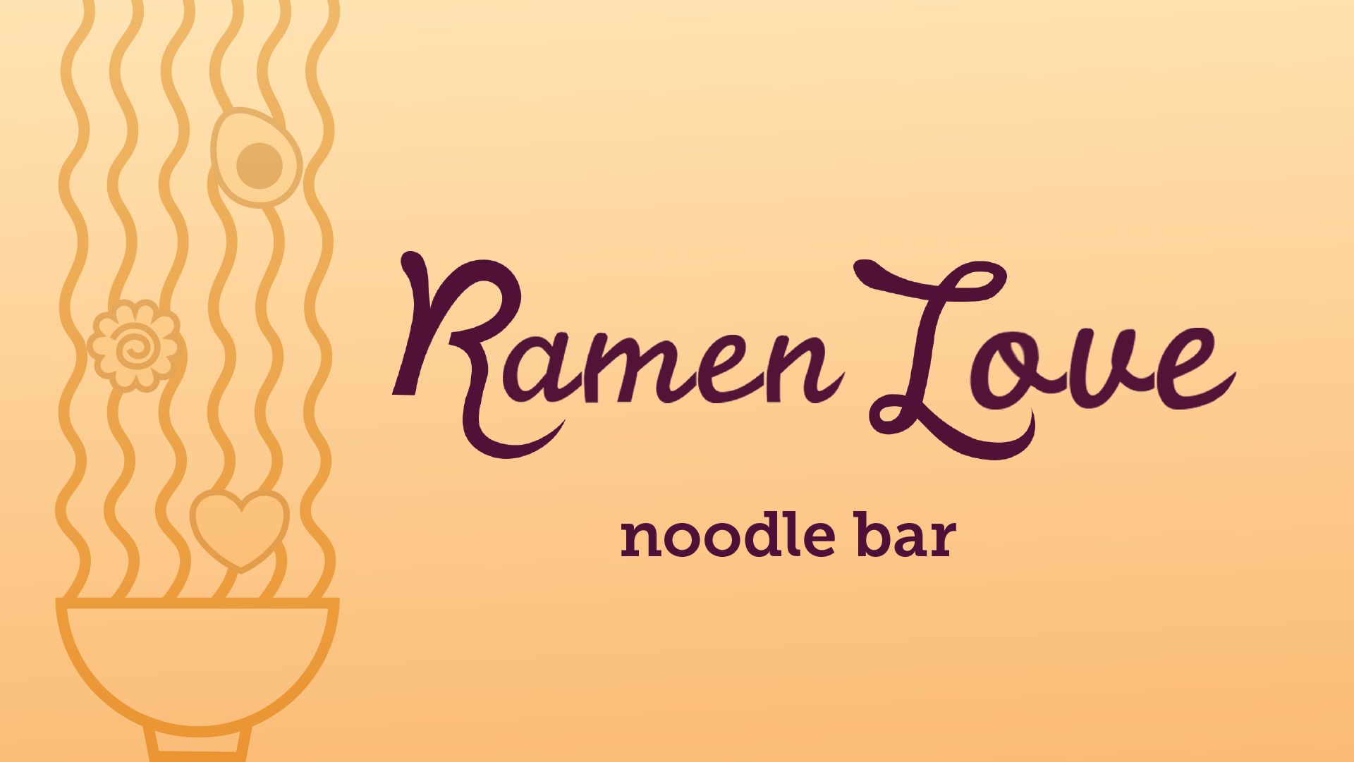
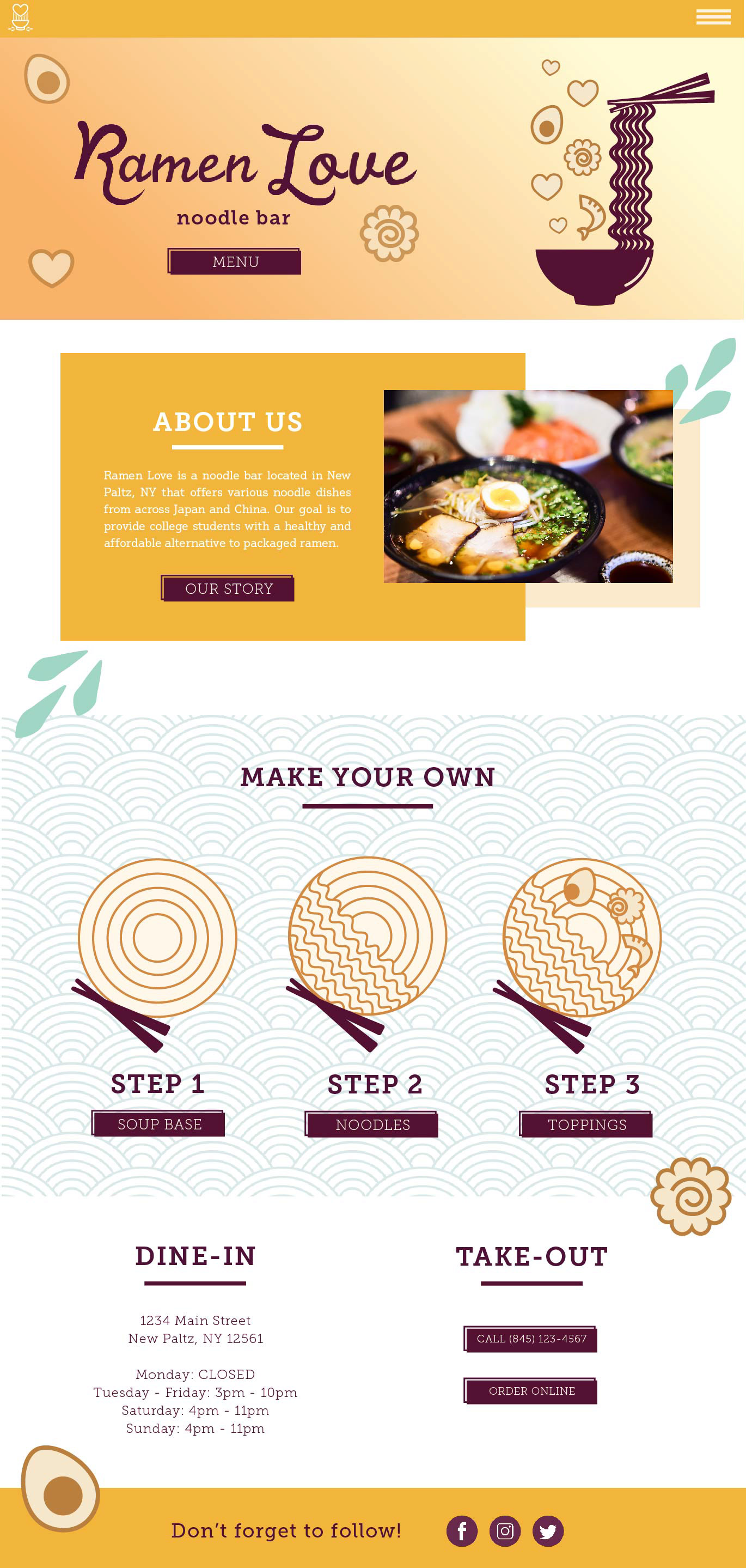
This restaurant was created to offer college students a healthier alternative to packaged ramen noodles while still being affordable. A warm and inviting brand will appeal to young adults who are either familiar with this type of cuisine or are completely new to it.
PROCESS
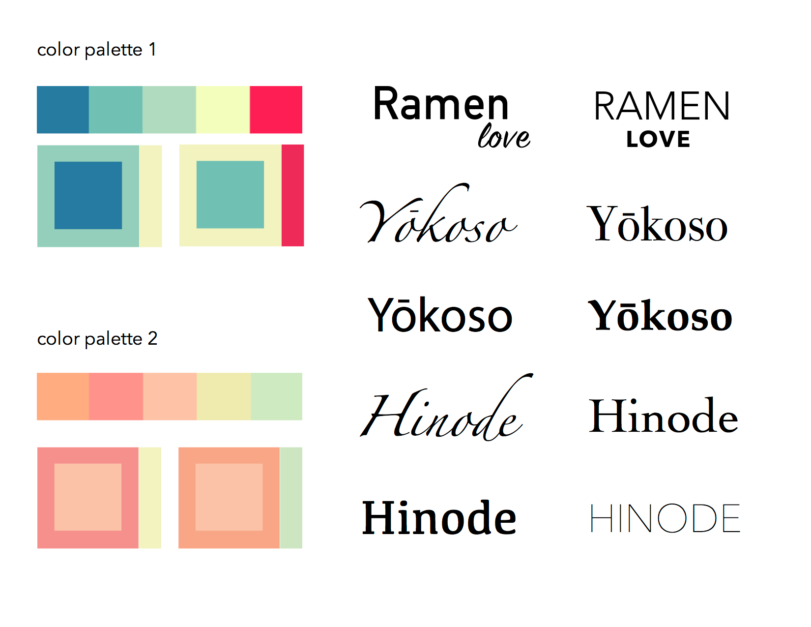
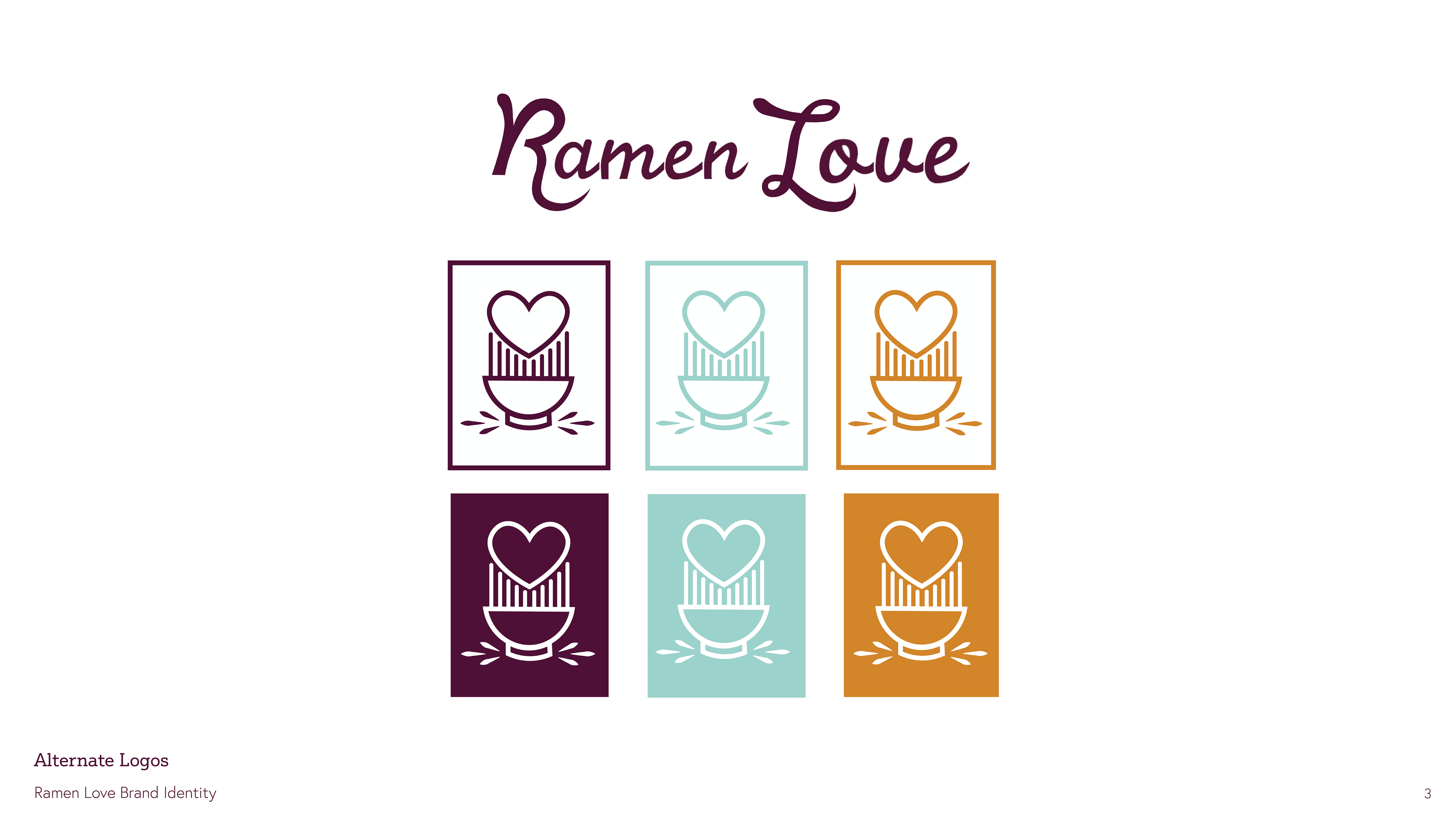
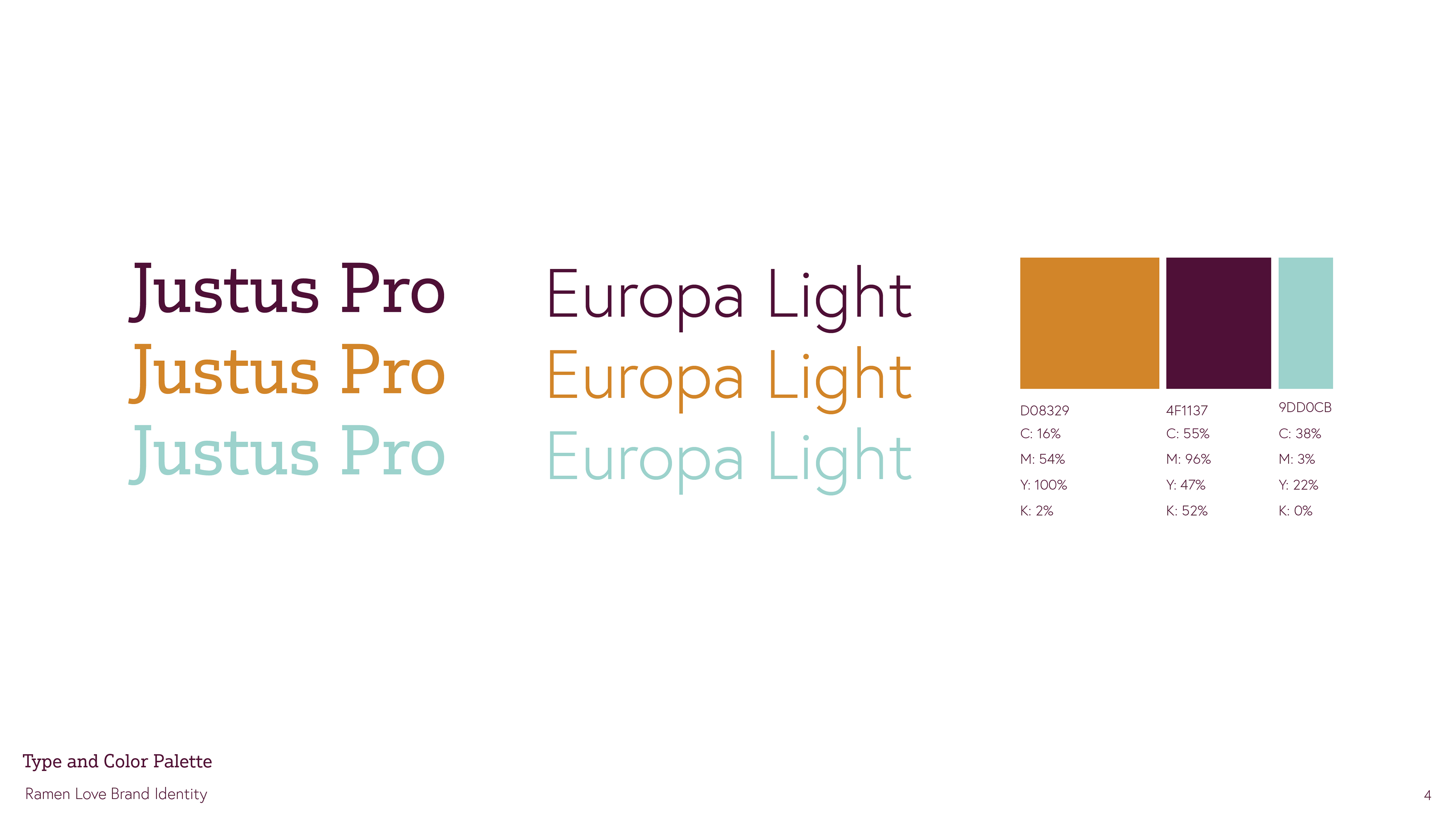
Initially, I was going to use pastel colors for the designs, but after doing visual research of landscape and restaurant imagery from China and Japan, I felt that gold and deep reds were the most prominent colors. I kept sea-foam green as it complemented the other two colors nicely.
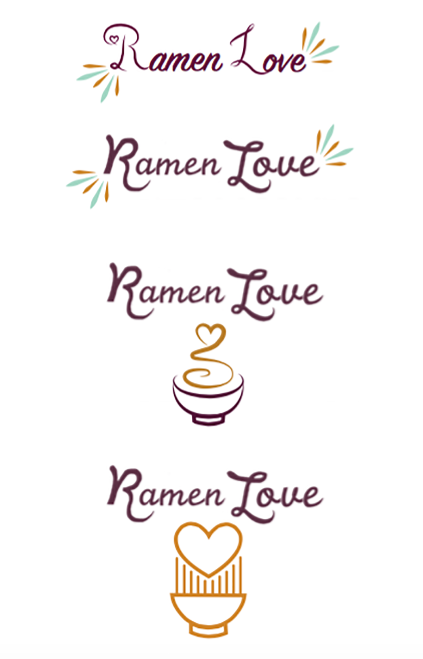
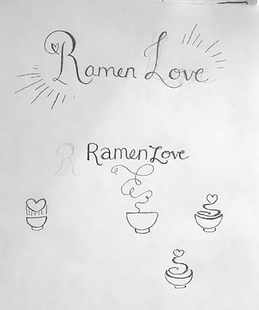
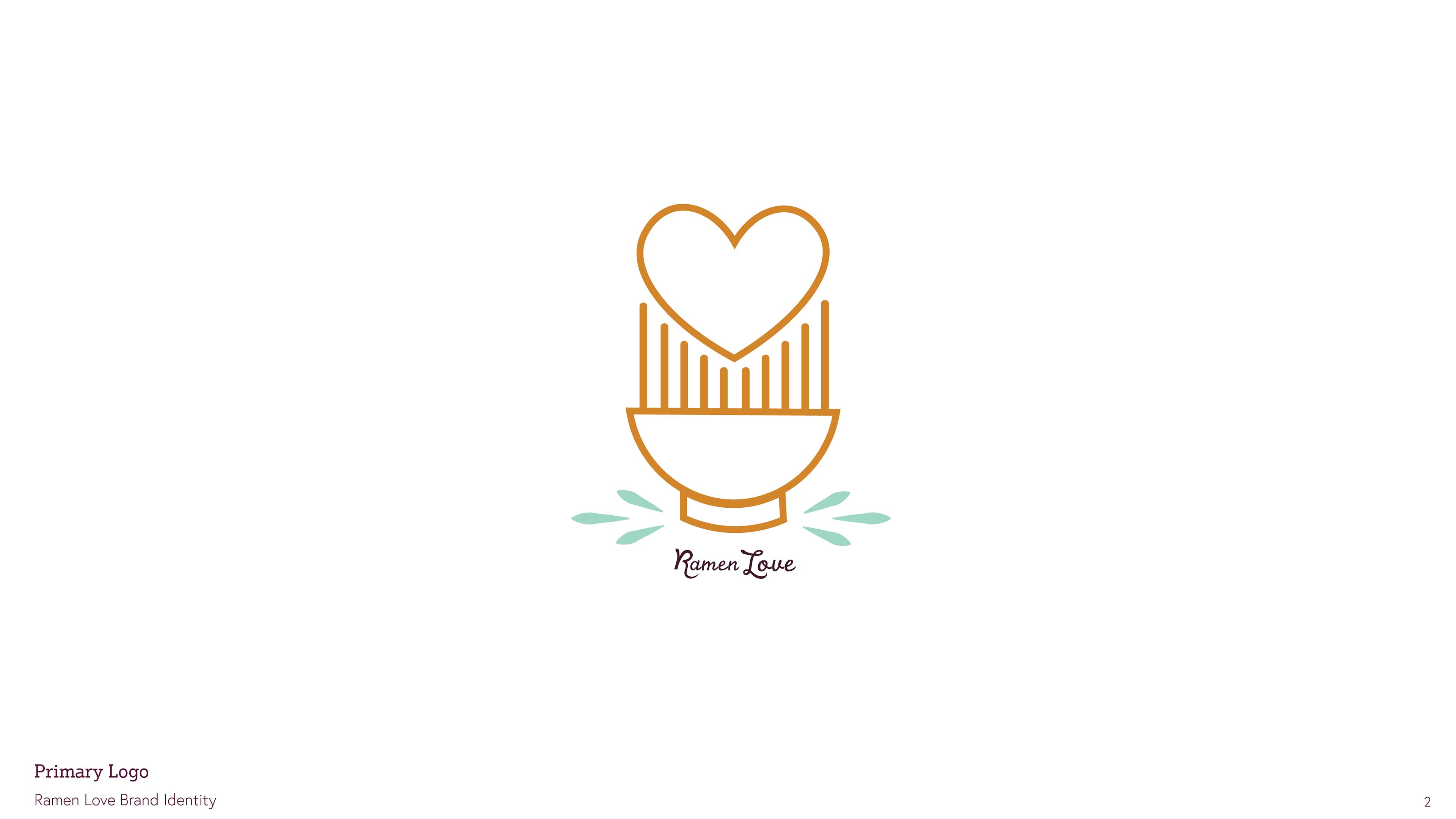
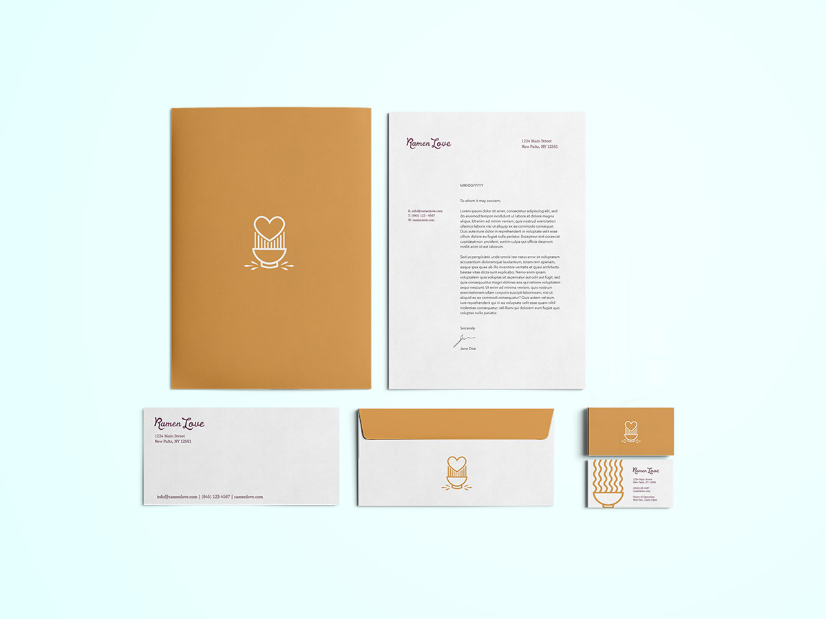
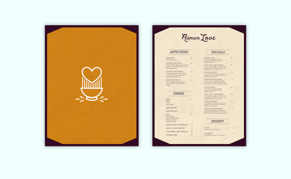
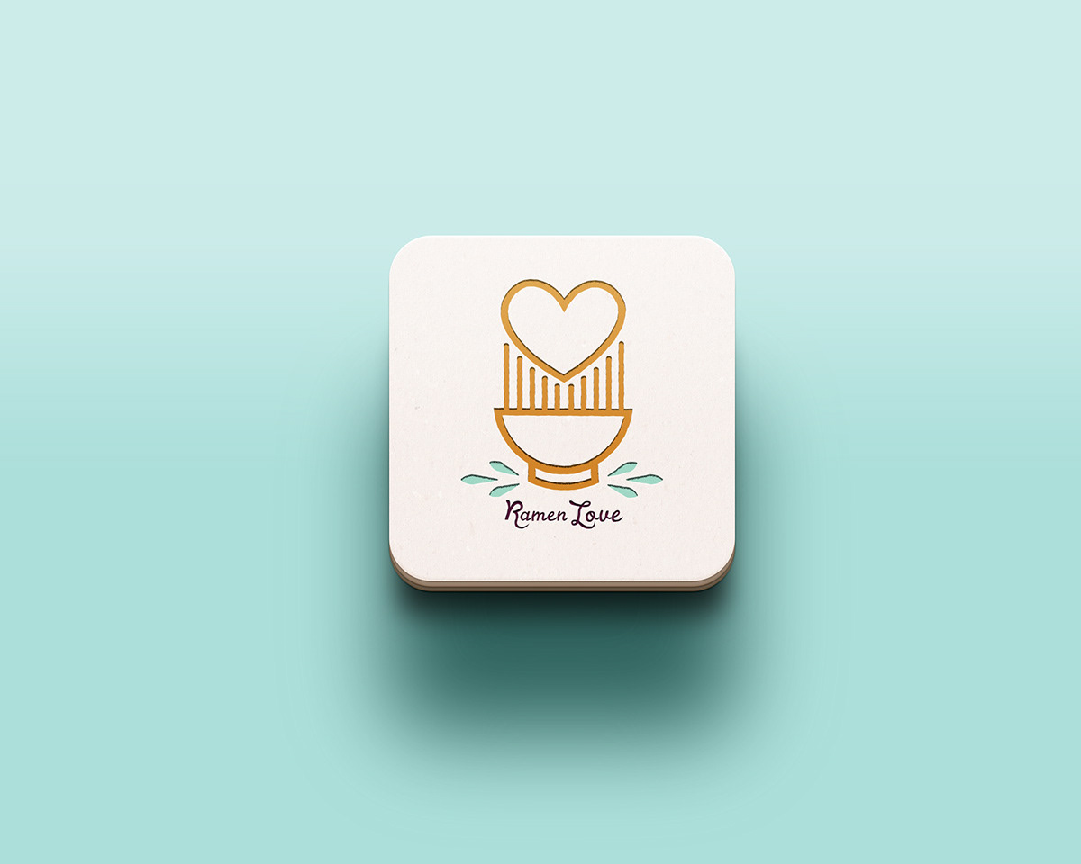
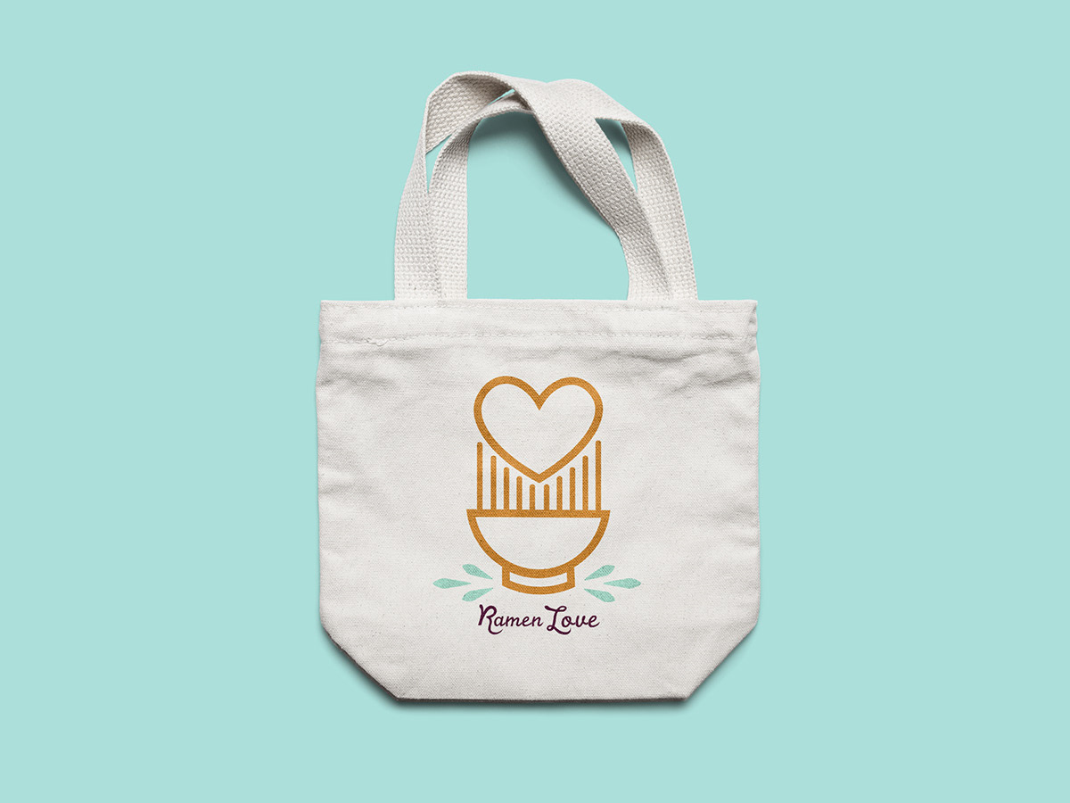
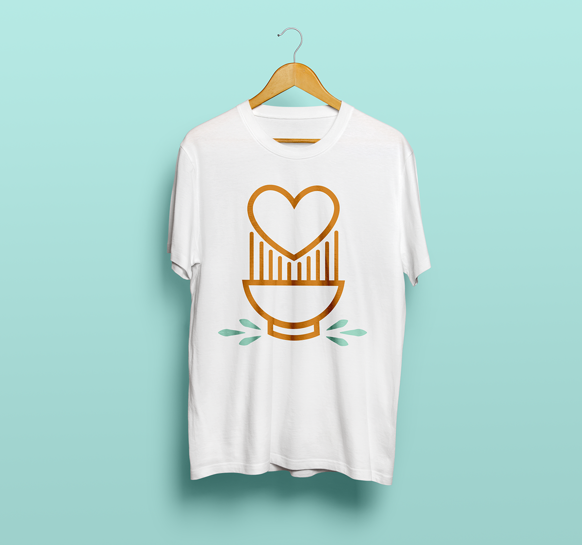
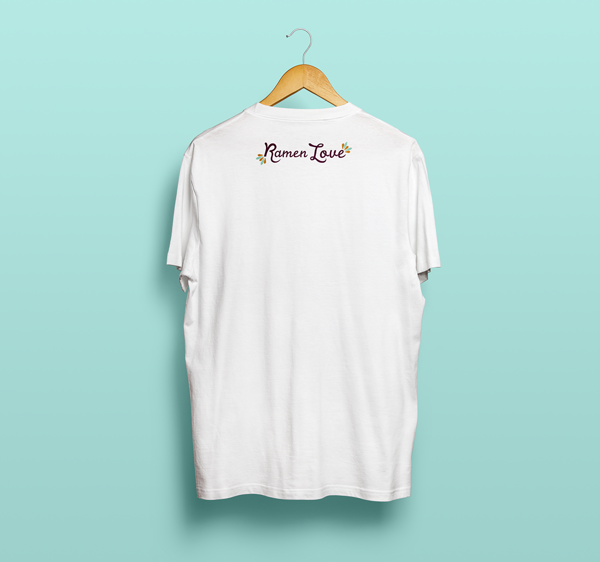
When creating the logo, I wanted something bold and graphic that could be versatile enough to look visually pleasing in both print and web formats. I was also striving to create a logo that would look intriguing on various merchandise and would catch the attention of someone passing by.