APPROACH
Based on the tone of the story Candide, a satire about optimism, this book was designed to be elegant but also a bit fun and odd. The style of writing doesn't seem to take itself too seriously, so I wanted the book design to reflect that. I played around with different serif fonts that fit this style of storytelling and also experimented with different ways that the title could be presented (as seen on the box cover).  I chose blue as the primary color to be used in this design as a symbol of innocence, reflecting the main character Candide's life-changing journey.
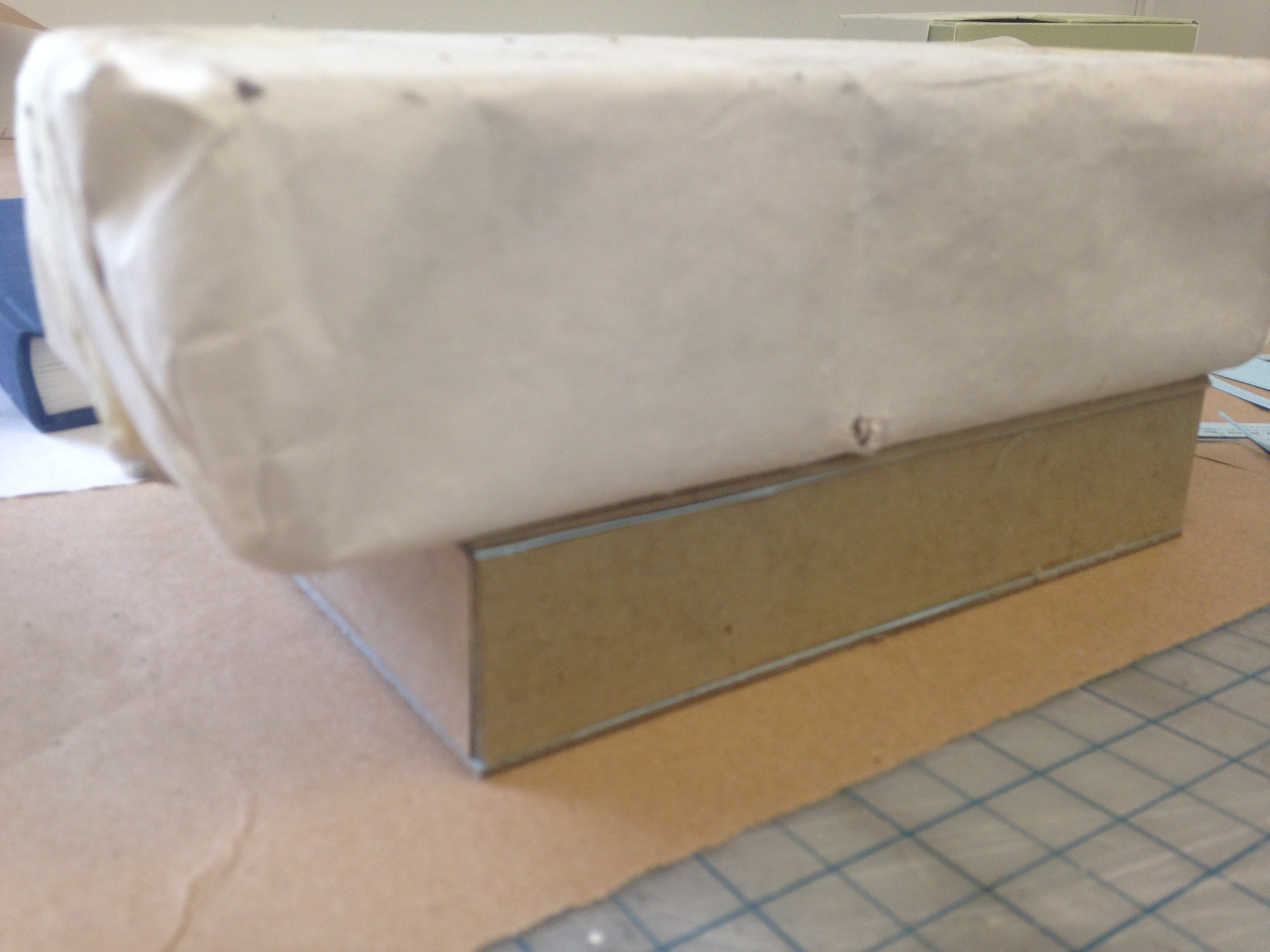
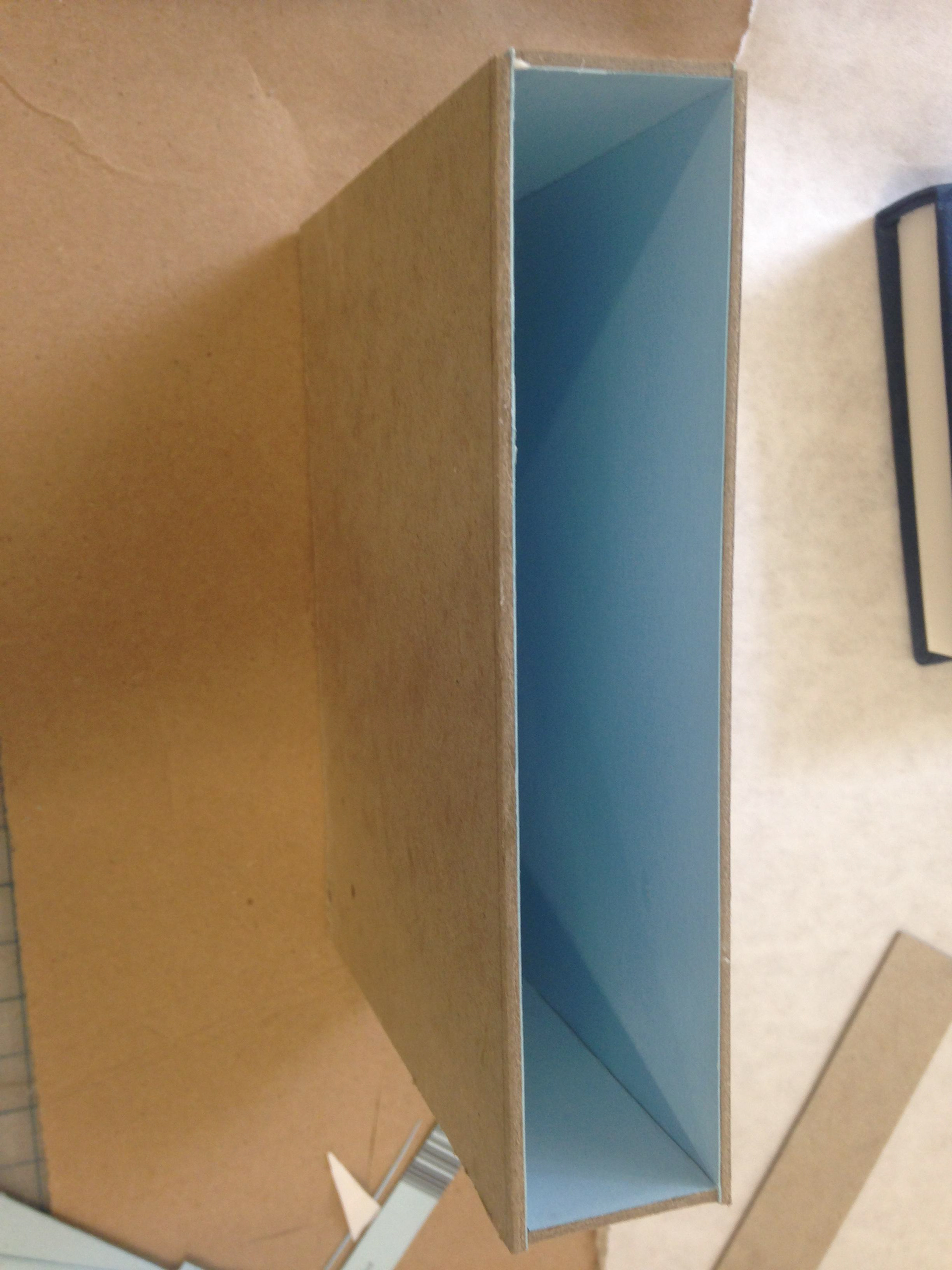
HARD COVER BINDING PROCESS
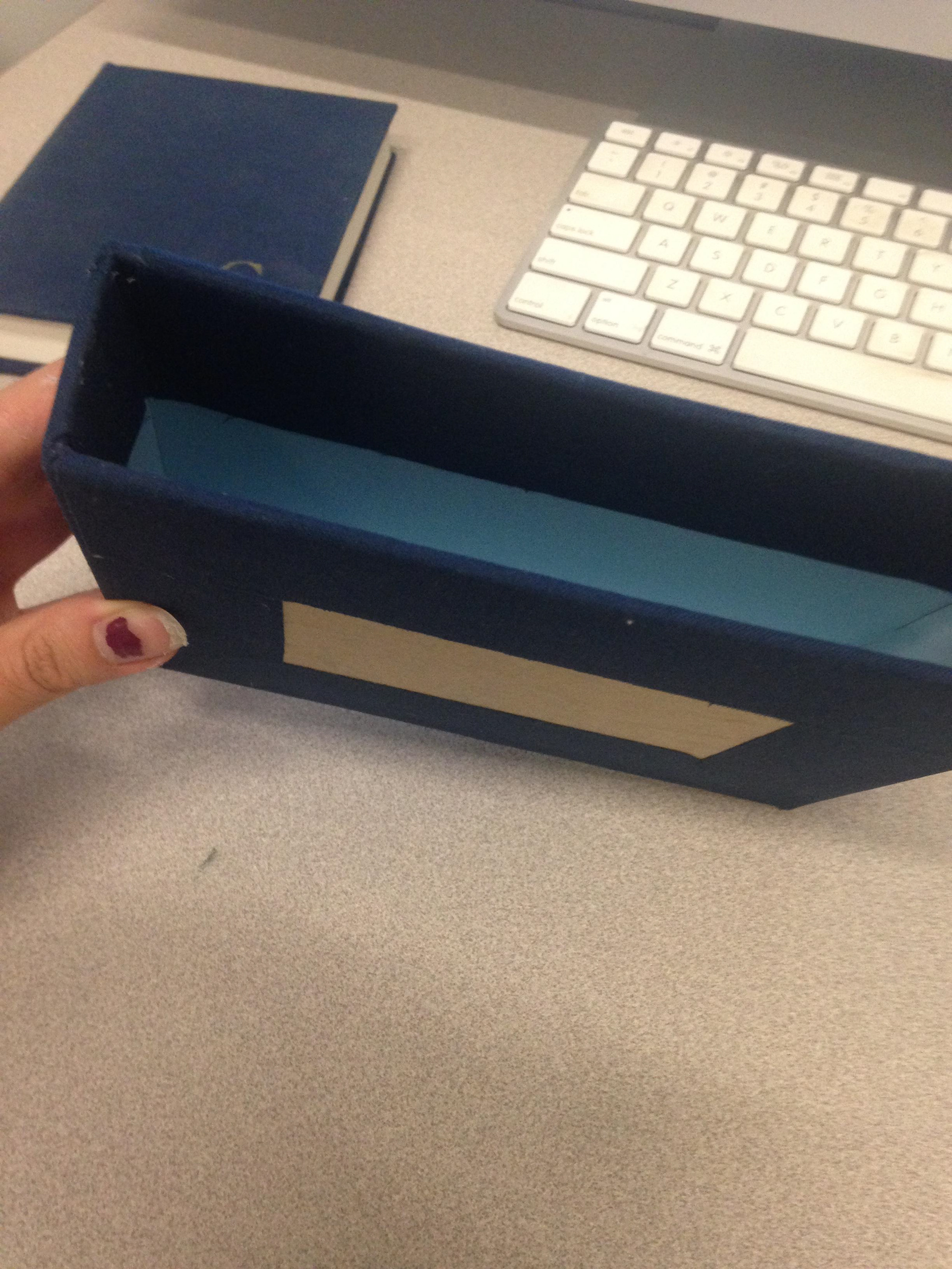
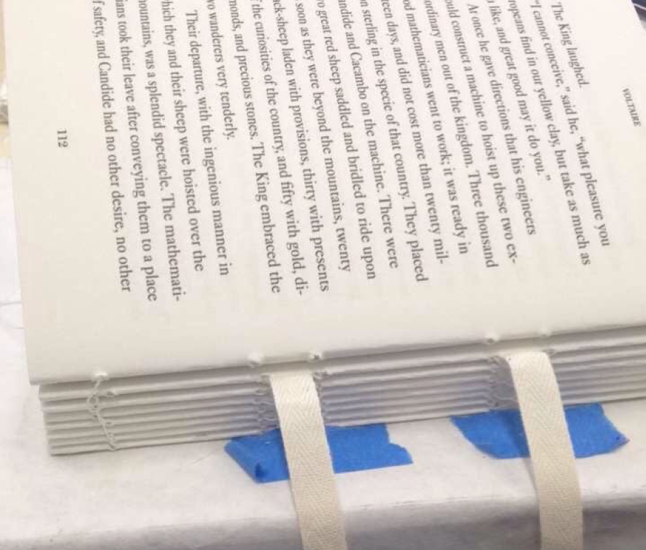
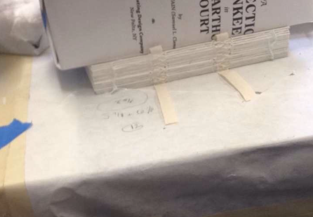
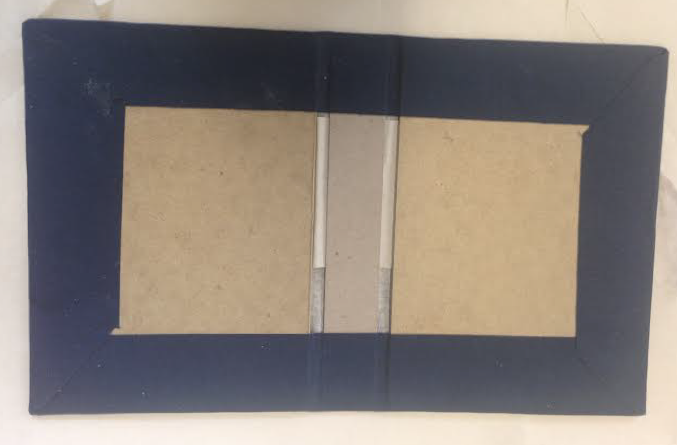
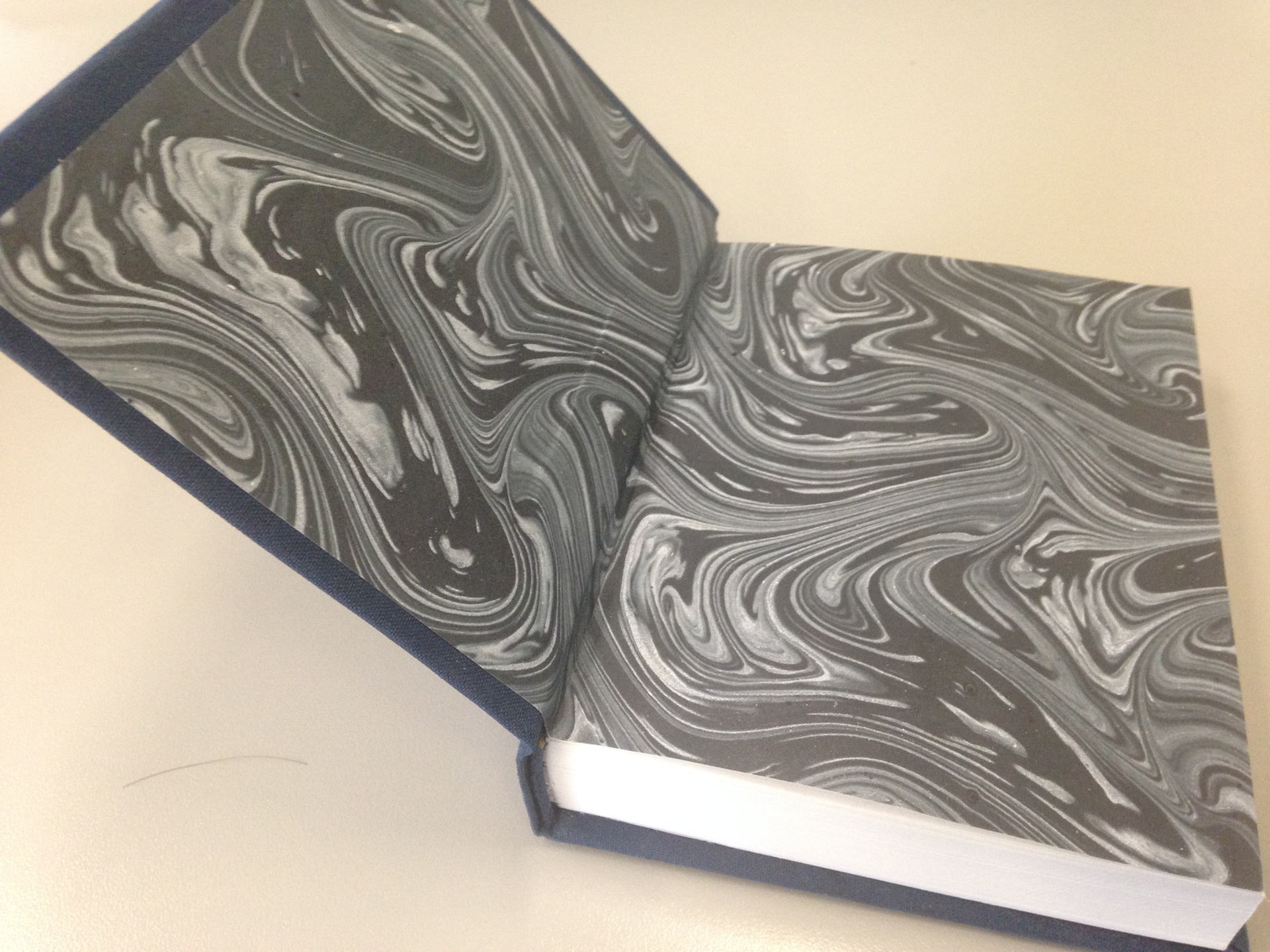
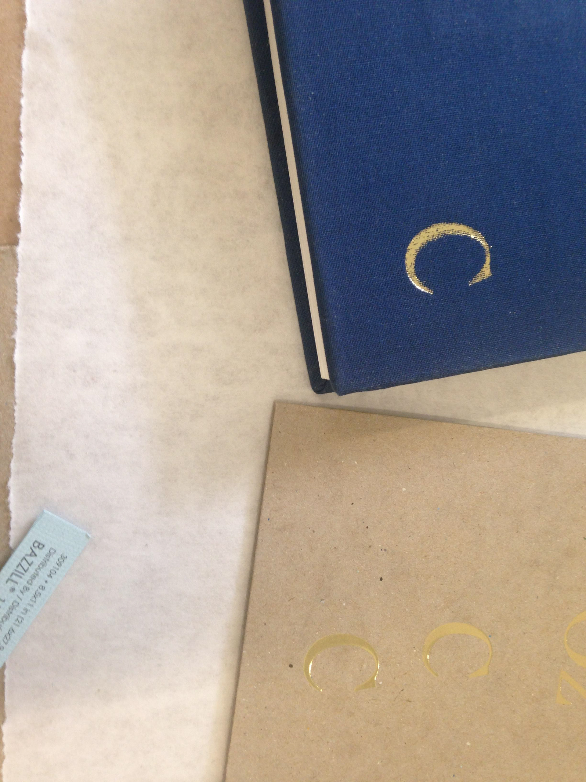
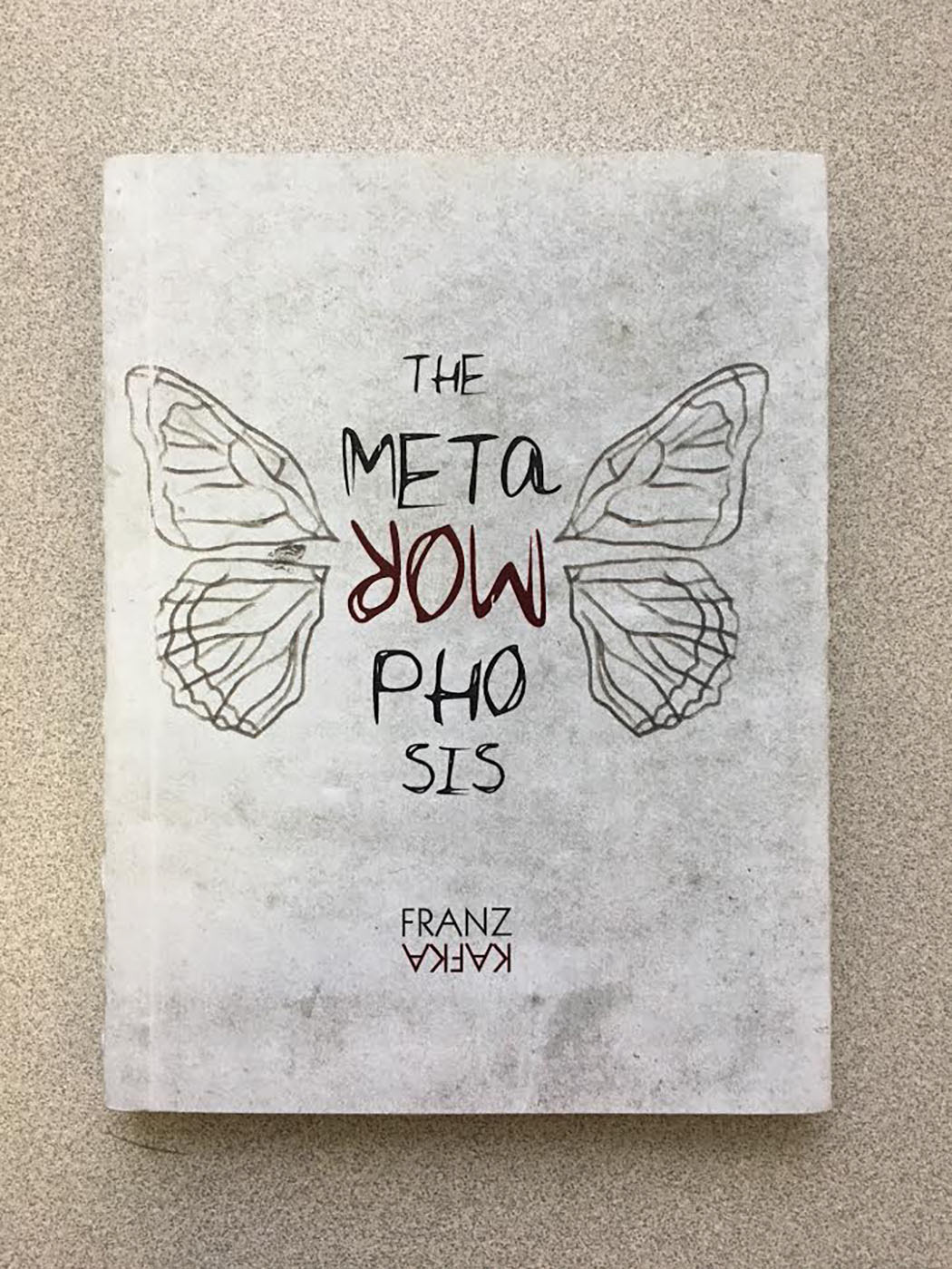
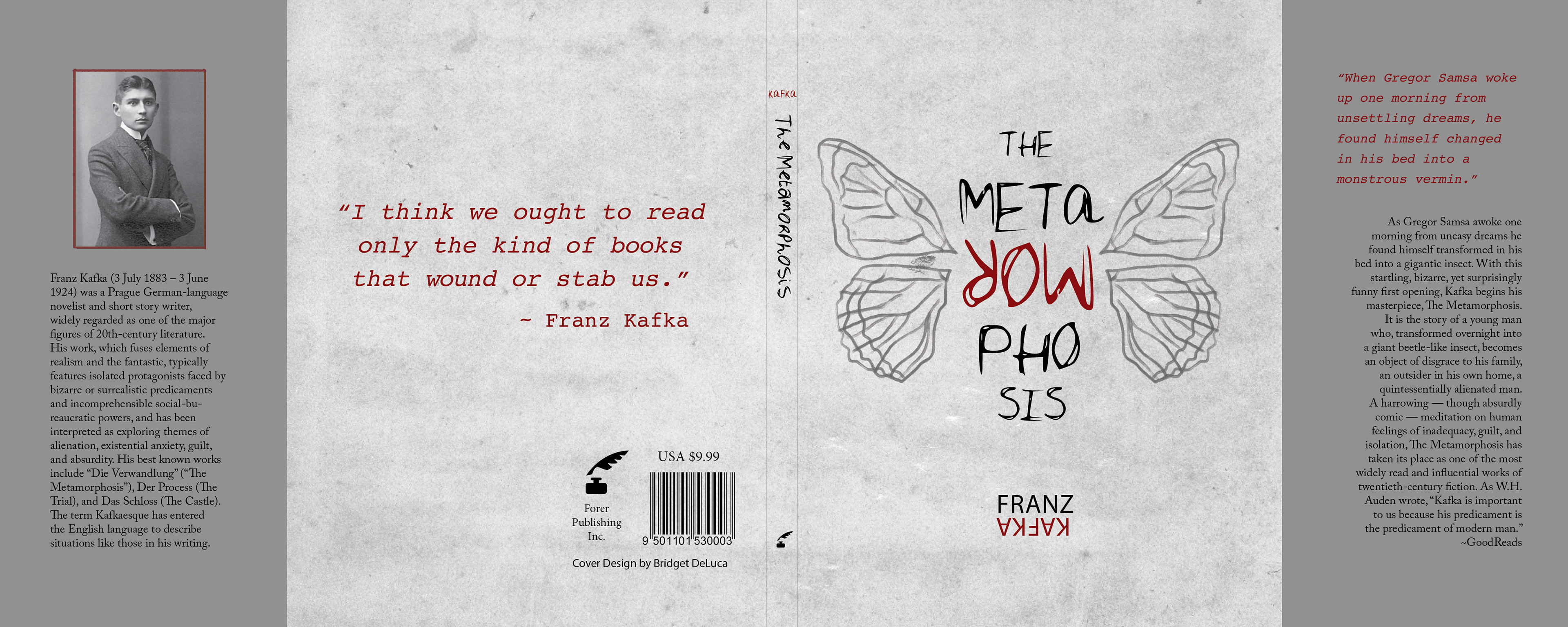
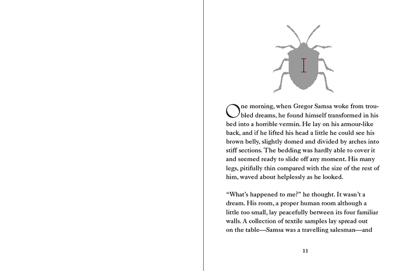
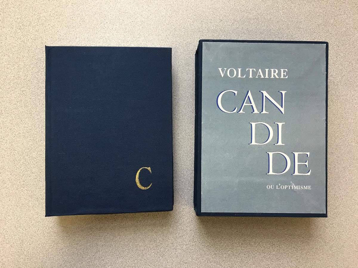
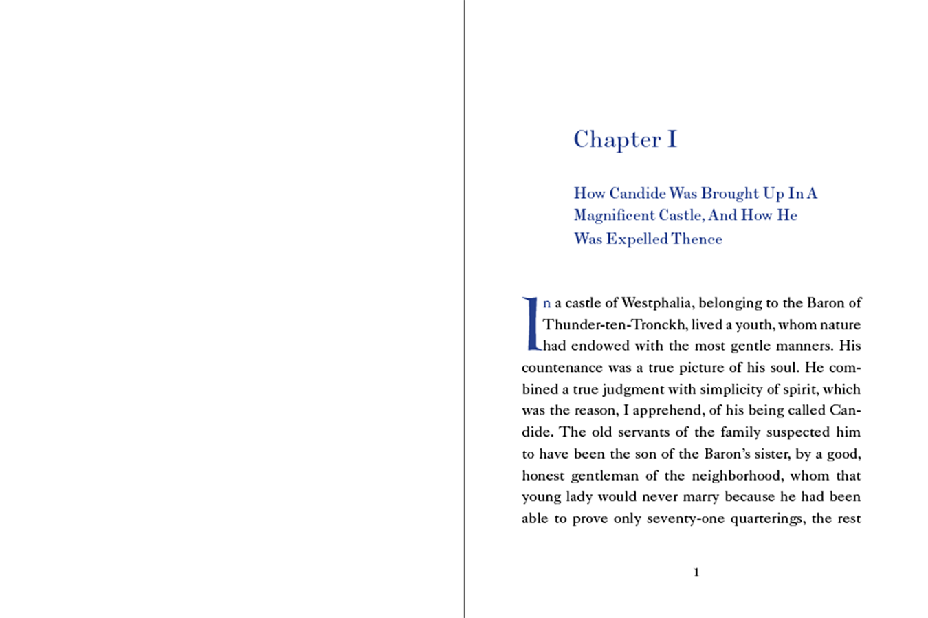
APPROACH
The Metamorphosis deals with themes of absurdity and isolation. For this design, I stuck with a darker color scheme, but with a pop of color.  For the cover, I used a typeface that seemed unruly and flipped some text upside-down to capture the absurdist nature of the book. I also experimented with texture and used my own insect wing illustration.  For the interior for The Metamorphosis, as well as in Candide, I chose the typeface Adobe Caslon because I felt that was easily readable and choosing a more serious font would compliment the display fonts nicely.
Back to Top